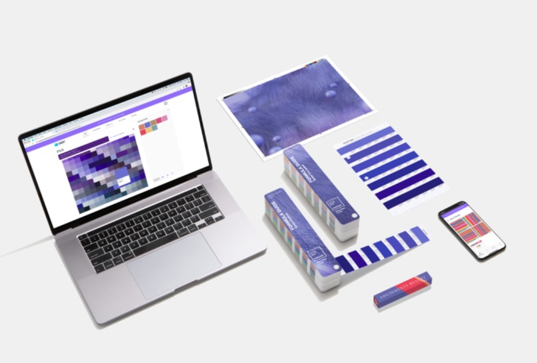
While many of us will spend the final days of 2021 reflecting on its whirlwind events, global color authority Pantone has already been busy looking ahead — to decide on the shade that will best encapsulate 2022. On Wednesday it unveiled Very Peri, a periwinkle hue that the company says combines the steady tranquility of blue with an energetic infusion of red. It’s the first time the company has manufactured a color instead of delving into their pre-existing archive, a decision that was a vital element of this year’s selection process. “It was really important for us to come up with a new color, because we have a very new vision of the world now,” said Pantone Color Institute’s Executive Director Leatrice Eiseman in a video call.

In 2021, the company was inspired by a new vertical: technology. From NFTs (non-fungible tokens) and space shuttle joyrides to Mark Zuckerberg’s promise of the metaverse, the year was characterized by our increasing reliance on automation and the digital realm. It’s a relationship that partly spurred on Pantone’s decision to work with Microsoft, among other partners, for its Color of the Year launch. Very Peri, for example, will be integrated into a range of Microsoft apps in the form of digital screensavers and interface options for PowerPoint, Teams, Edge and Windows. Similarly novel is Pantone’s imagery — this year the new shade is unveiled via a piece of digital art as well as the traditional swatch, solidifying the color’s connection to the tech world. Whether 2022’s Very Peri is welcomed with open arms or not, Pressman and Eiseman are simply content with the conversation. “It’s astounding to me that I will hear people talking about the color of the year, people that aren’t otherwise connected to color in any way,” said Eiseman.”We’ve seen it grow incrementally over the years. And we’re somewhat astounded by it, but delighted by it,” she continued. “Because that’s our purpose.”

The pandemic has heavily impacted how we normally live and work — posing obstacles that have forced people to think outside the box. “We’ve gone through so many challenges over this time, we don’t know what’s going to pop up from one day to the next,” said Pantone’s vice president Laurie Pressman, who was also on the call. “It’s curiosity that’s helping people to get through these difficult times. What we would call courageous creativity .””The color symbolizes the future,” Eiseman adds. “(It) has that sprightly, joyous attitude that we’re talking about, that carefree confidence, and creative spirit.”